mint Salary homepage redesign
Concept: To redesign mint.com/salary page for upcoming set of going to market initiatives and to direct more traffic to the Mint salary experience from our broader channels, social media and articles fueled by PR.
UX&UI objectives addressed with the redesign:
Make it easy for Mint prospects and customers to learn more about the service and how it can help them to achieve their goals from this entry stage.
Optimize landing page UX&UI by elevating most popular components from the previous page version.
Improve tone&voice with the new value prop messaging (based on market research) and latest design style and illustrations.
Approach:
By analyzing the user research reports and conducting more users sessions we learned why users come to the Salary website - to learn how to earn more, find trustworthy salary information and get educated on what steps to take to improve their financial situation. We also got some helpful web data points on existing user flow performance including the pages from the next navigational level. That helped a lot to understand how to better strategize around page IA. With all that knowledge it was easy to meet our marketing goals and improve the user experience. I helped to optimize the page structure, added a few educational & actionable content blocks with some relevant data points, applied friendly tone & voice to the experience, and developed aesthetically pleasant visual style.
My Role: UX/UI/Visual designer and I worked in close collaboration with product managers, SEO exerts, data team, engineers, visual and content designer.
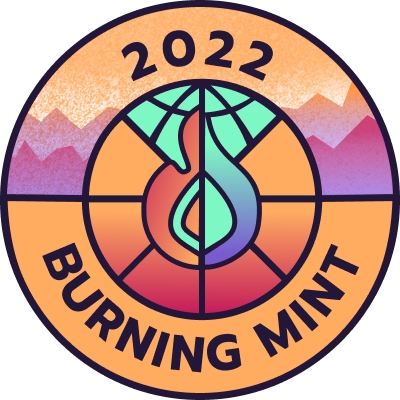
“Burning Mint” festival creatives. patch. logo. wristband.
Fun and super creative project to support one of the corporate product launches and celebration festival named after it.
Approach & thinking process:
My idea for the creative came from the inspirational research. I checked various sites with Burning Man art and themes from all of the years since the first one. I decided to align the main creative line for the design with its’ venue - burning hot, RVs parking in a circular shape, the sandy desert with a “splash” of mountains on the background. The main challenge was to bring the feeling of heat while trying to stay on Mint brand which embraces the cold colors of pallet. By introducing the raspberry shade of red and applying a gradient with a mix of cool and warm colors I was able to achieve the right color schema balance for the composition. That balance help to tight together cool and warm colors nicely while allowing designs to stay brand compliant.
My Role: Visual and graphic designer.
More samples and use cases coming soon.


